
FIS’s retirement platform is licensed by banks and runs under their own brands. I led the UX redesign across web and mobile, ran three rounds of live testing, and built the design system it runs on.
fisglobal.com >01 / big idea
One platform that every bank can call its own.
FIS sells to banks, but the people using the product are account holders checking their retirement on a phone. The redesign had to serve both, a system any bank could brand, and screens anyone could understand.
02 / my role
- Planned and ran three rounds of live usability testing
- Designed the information architecture and flows for desktop, mobile, and native apps
- Built the token-based white-label design system
- Presented prototypes to leadership and institutional stakeholders
- Managed an offshore team on accessibility and UI specs
- 1,000+Pages redesigned across desktop, mobile, and native apps
- 12Test participants across account holders, bank reps, and advisors
- 3Rounds of live testing, each one changing the product
03 / Problem
Built for institutions, not people
Two decades of financial infrastructure had to feel simple to someone checking a balance on a phone.
FIS runs the back end for banks around the world. Its retirement platform was robust but dated, hard to navigate, and built around institutional requirements. Banks needed a platform they could brand as their own. Account holders needed the complexity simplified without losing the information they rely on.
- Institutional need
White-label for major banks
Banks like Wells Fargo needed to apply their own colors, logos, and style without rebuilding anything.
- User need
Clarity over complexity
Jargon, dense tables, and desktop-only navigation broke down completely on phones.
04 / Research
Three rounds of live testing
Every decision that mattered came from a user, not a brief.
- Round 1, desktop
Language and communication
People stalled on financial jargon and expected email confirmations, a gap no one had raised internally.
- Round 2, mobile
Tables were unusable
Scrolling data tables failed on small screens.
- Round 3, A/B
Adjusting live
I A/B tested alternate designs within a single session, and changed them on the fly to confirm the solution with the user before engineering committed.
Competitive audit
| Feature | Vanguard | Charles Schwab | FIS |
|---|---|---|---|
| White-label customization | |||
| Email notifications | |||
| Retirement management | |||
| Projected retirement income |
Vanguard and Charles Schwab set users’ expectations, but FIS was competing for the bank, not the saver. White-label flexibility and projected retirement income were what mattered to the institutions buying it.
05 / Key insight
The users asked for it, so I made it part of the plan
Research only matters if it changes what gets built.
In the first round, account holders expected an email whenever their account changed. The platform only confirmed changes inside the app, and email wasn’t in scope. At FIS scope came from product, not from design and certainly not from users. I gathered their feedback into a presentation, designed the email templates, and made the case to product and engineering. They added it to the release.
Users outside the company changed what got built.
06 / Decisions
What testing changed
Cards, not tables, on mobile
- Noticed
- In round two the desktop tables, even scrolling ones, failed completely on phones.
- Decided
- Replace them with cards built for phones, with a readable hierarchy, instead of adapting the desktop pattern. Organize documents the way people search for them, by date and type.
- Result
- Transaction history and plan documents read cleanly on a phone, and anything that needs an upload points people to the right place.
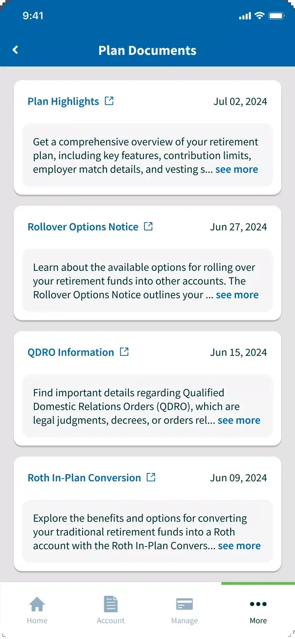
Documents as cards, sorted by date and type 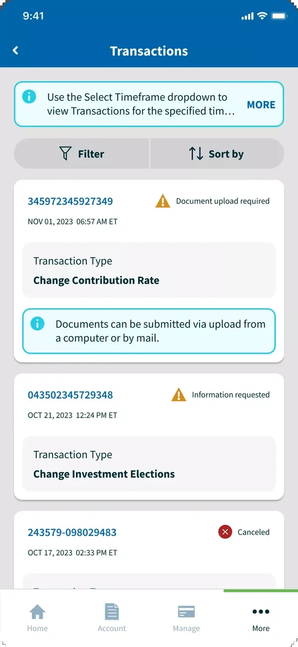
Transactions as cards, not a table
Put what people check first
- Noticed
- Rate of return was one of the most-requested features, but it was buried in a sub-page.
- Decided
- Build the dashboard around what people check most, balance, trend, projected income, and rate of return, and rewrite the jargon in plain language.
- Result
- The answers people came for are on the first screen they see.
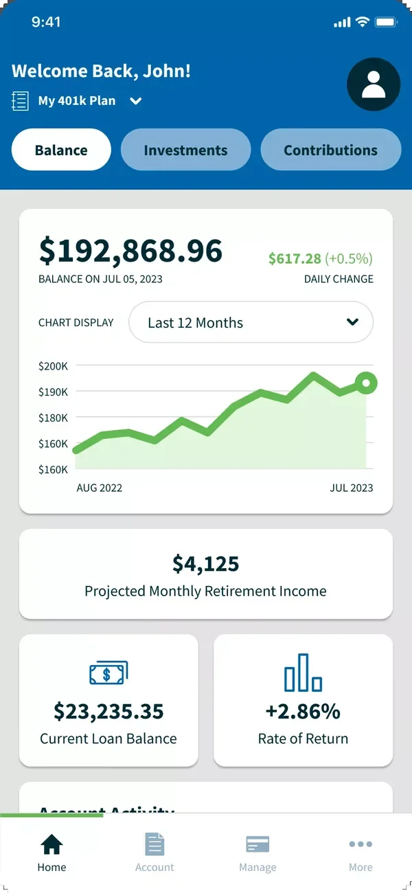
Dashboard with balance, trend, and projected income 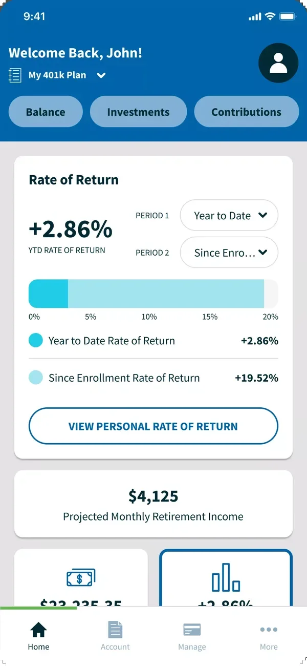
Rate of return, moved up from a sub-page
Simpler, not less
- Noticed
- Users wanted it simpler, but they still needed the full depth of their account. Withdrawals and transfers were the most confusing flows.
- Decided
- Keep the core information architecture, simplify through navigation and language, and end every change with a clear confirmation, on screen and by email.
- Result
- Nothing was hidden, the hardest flows became the clearest, and people know their change went through.
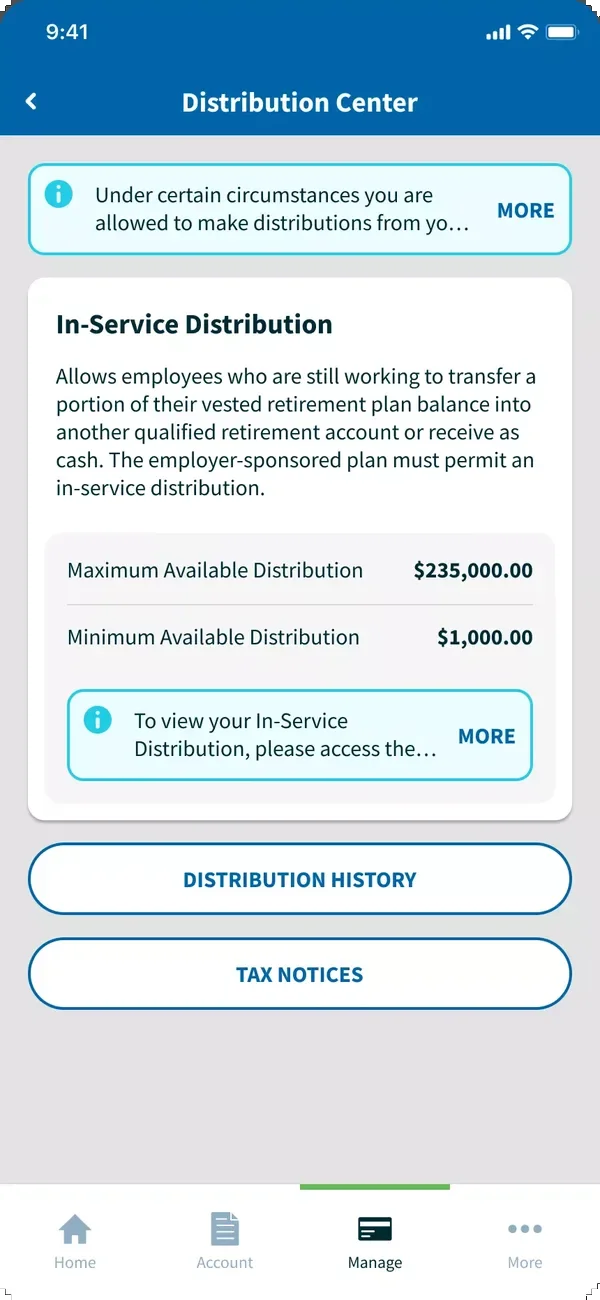
Distribution center, once the most confusing flow 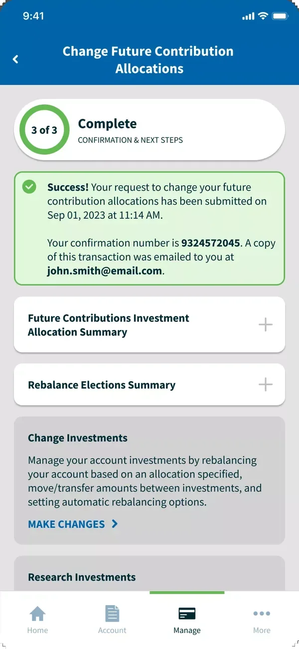
Confirmation, with a copy sent by email
07 / How it works
Built to be owned by someone else
Everything would be reskinned, so the system had to absorb any brand without breaking.
- Tokens
Brand at the variable level
Institutions override color, type, and spacing tokens, never the components.
- Accessibility
Built into the library
Standards live in the components, not checked per platform afterward.
- Multi-platform
One system, every surface
Desktop, mobile web, iOS, and Android share components, so updates reach all four.
- Team
Documented for handoff
An offshore team across time zones worked from clear specs, which made the system better for banks too.
The final white-label designs for each bank are kept private to protect FIS’s clients.
08 / takeaway
What I carry forward
Research shows its value when it improves the product. The mobile cards, the email confirmations, and the plain-language rewrite weren’t in the original scope. They came from users telling us their expectations. Managing a team in another time zone taught me the same about systems. If a component isn’t clear enough for them to build, it isn’t clear enough for a bank to customize.